
Here at PostFunnel, we’ve talked a lot about email newsletters.
We’ve debated whether they’re an effective marketing tool (they are). And we’ve laid out some best practices when crafting your own.
Today, we’ll show some examples of varying newsletter quality and dig into what makes these newsletters so great – or so not great. We’ll focus on:
- The newsletter’s physical layout
- The aesthetic and appeal
- The copy and calls-to-action
Let’s get started.
3 Incredible Examples to Inspire Your Future Email Content
Esprit
Esprit is an online clothing retailer catering mostly to Europe and Asia. The brand created the newsletter below to showcase its recycled materials clothing collection.

Organization
Even a cursory glance shows that Espirit is well organized. The clothing items are grouped by category (“Eco Cool,” “Eco Denim,” and “Eco Chic”), and rather than separate items by type (i.e., shirts in one section, pants in another), they created full outfits. Not only does this make it easy for audience members to find exactly what they’re looking for, but it opens the door for potential cross-sell opportunities as well. It’s worth noting that the newsletter features both standalone and action product photography shots – a consistent theme throughout.
Aesthetic Presentation
If we summed up the newsletter’s appearance in one word, it’d be “relaxed.” To complement (not complete with) the clothing’s pastel hues and soft shades, the newsletter is designed in white, black, and shades of grey.
The font may be on the fancier side, but it’s easy to read and uses small doses. For product descriptions and the footnote, Esprit uses a cleaner, more basic style. Lastly, the contrast between the font and background color makes the newsletter engaging and easy to read.
Copy and Calls-to-Action
In one crisp sentence, Esprit introduces both eco-conscious fashionista Christina, and its line of eco-friendly clothing. There’s no missing the purpose behind this newsletter. Throughout the mailer, the copy invokes senses like sight and touch, using phrases like “natural shade,” “delicate pink,” and “elegant, soft jacket” to make their styles come alive.
Including multiple calls-to-action can sometimes distract your audience, causing more harm than good – but that isn’t the case here. Thanks to clear descriptions, readers can easily determine which CTA will bring them to the page they want to visit.
The Verdict
Esprit packs a lot of content and offers into its newsletter – without being overwhelming. While the newsletter highlights a variety of items, the structure makes sense from a logical perspective. As we’ll talk about, this approach can easily fly off the rails if your newsletter lacks a specific theme.
By providing a ‘something for everyone’, Esprit ensures this newsletter will create maximum engagement among its conscious consumer segment.
Away
Away is a relative newcomer to the luggage and travel industry. Much of Away’s content marketing is intricate and in-depth, but the brand takes a more simplistic approach with its newsletters.

Organization
Like Esprit’s newsletter, we know right away what this brand is promoting. Each section of the newsletter contains the same format, in an easily digestible linear layout. The whitespace creates an invisible border, establishing a clean UX with few distractions. Away saves its logistical information for the end of the newsletter, compiling contact information, terms of use, and copyright data into a footnote for those interested.
Aesthetic Presentation
Away focuses on a single product, adding variety by showcasing the product’s various color scheme options. It makes sense that each color is featured within the appropriate subsection of the newsletter and that the newsletter has a plain white backdrop, causing the shades to ‘pop’.
Each photograph depicts the item in a color coordinated environment, and the color swatches in each section prime the reader for what’s to come in the next photo.
Copy and Calls-to-Action
Each product description matches the overall feel of the newsletter, getting right to the point of its message. Phrases such as “bold, warm red” and “elemental neutral” evoke emotions and strong imagery. Additionally, the copy within the subhead – “Find the (color) that speaks to you” – further evokes a sense of individuality and adventure.
It’s simple: those who wish to purchase the product in a specific color just need to click the appropriate CTA; those who want to browse a bit more can opt to “Shop All Colors.” Finally, the ‘refer a friend’ CTA sits unassumingly at the top corner of the newsletter, enticing customers to add their opinion.
The Verdict
The newsletter does a great job of persuading recipients to further engage with the brand. With simple and straightforward calls-to-action, Away’s simple, minimalistic newsletter caters to individuals with various tastes. Its use of color to convey emotion and meaning fits in perfectly with Away’s overall motif, which focuses heavily on the use of vivid imagery.
Fortnum & Mason
Of the three noteworthy newsletters, we’re featuring, this one from luxury tea, coffee, and food company Fortnum & Mason is the most fun and exciting.

As you can see, F&M uses its Halloween-themed newsletter for a variety of purposes, from showcasing holiday-themed products to promoting in-store events.
Organization
Though the newsletter has plenty going on, the information isn’t jumbled on the screen. In fact, a closer look shows great attention to organization, with each subsection leading into the next in a logical and purposeful manner.
The header and footer provide logistical and transactional information, and by leaving this information at the newsletter’s margins, F&M ensures that the reader focuses on their promotions – but can still engage if they desire.
Aesthetic Presentation
Even if you didn’t read a single word of this newsletter, you’d immediately recognize the focus on Halloween and fall-themed celebrations. From the spooky imagery, to the product photos, to the autumnal color scheme, it’s immediately apparent what this newsletter is all about. But regardless of how dark and eerie the newsletter feels, every bit of text is 100% readable through the use of contrasting colors.
As we mentioned, the header and footer of this dispatch act as addenda to the actual newsletter. As far as aesthetics go, while the color schemes and fonts match the newsletter’s theme, the header and footer align with F&M’s regular website branding. This helps indicate where the offerings begin and end.
Copy and Calls-to-Action
If its appearance doesn’t put you in a Halloween mindset, the first line of copy will do the trick:
“The Beast Comes at Midnight: A spooky tale to whet your appetite…”
The copy that follows – both within the story and the rest of the newsletter – uses Halloween phrases and puns in a lighthearted manner. Bonus points for phrases that appeal to the reader’s taste buds, such as “frightfully delicious,” “devouring a book,” and “gore-geous biscuits.”
As should be expected with such a fleshed-out newsletter, F&M includes numerous calls-to-action throughout the piece, including:
- “Shop Halloween” (i.e., visit the company’s themed category page)
- Create your own goodies assortment
- Sign up for an event at F&M’s brick-and-mortar location
- Follow the brand on social media
By providing so much opportunity for engagement, F&M increases the likelihood that recipients grab at least one of these options.
The Verdict
As far as holiday-themed newsletters go, this one is a masterpiece.
Perhaps most noticeable is that, in addition to all its promotions, F&M had fun with their mailer. The brand includes plenty of content and promotional material without weighing down their newsletter, even providing several CTAs without making readers feel they’re being stretched too thin.
2 eCommerce Newsletter Examples Not to Follow
Spirit Airlines
Spirit Airlines pulls in billions of dollars in revenue on an annual basis, despite the fact that their marketing team once thought the following was acceptable:

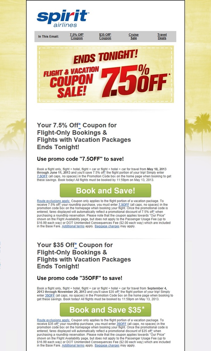
Organization
This newsletter is all over the place. It jumps from offer, to fine print, to call-to-action, to fine print… it’s fairly confusing. Newsletter layouts should prompt readers to check out the entire piece. With this one, I’d be surprised if anyone read past the first section.
Aesthetic Presentation
There’s little to no branding here. Take away the logo at the top of the page, and you’d have absolutely no idea which company is behind this. Strike one.
Moreover, the newsletter just isn’t pleasant to look at. Its stock photo palm tree background is more sad than appealing and lends little to the content. Strike two.
Finally, the poorly-formatted text is distracting to the point that it’s actually frustrating. The entire newsletter is left-justified, there’s little text framing, and the seemingly random use of black or grey text does nothing to hold our attention. Strike three.
Copy and Calls-to-Action
As for the actual content, there’s just too much going on. The heading is a scrambled mess that requires several takes to digest: “Your 7.5% Off* Coupon for Flight-Only Bookings & Flights with Vacation Packages Ends Tonight!”
Then, of course, we have the fine print, which makes up the majority of the newsletter. If you actually take the time to read the fine print, you’ll likely end up more confused than when you started. Spirit could have saved its audience time and frustration by simply saying, “This offer probably doesn’t apply to you, thanks though!”
Finally, the calls-to-action are boring, salesy, and inconsistent. The first CTA – “Book and Save!” – is incredibly generic and doesn’t explain what exactly the reader will be saving. The team included the specific offer in the second CTA; why couldn’t they do the same for the first?
It’s also worth noting that there aren’t any CTA links to Spirit’s main site (or other areas of the website). In other words, the audience has two options: engage with one of the two offers, or close out of the newsletter completely.
The Verdict
This newsletter is poorly designed, poorly formatted, and sloppily written. The forceful urgency (“Ends tonight!”) is misguided as well. You want your audience to act quickly, but how many people will be willing to plan a trip and buy a plane ticket in less than 24 hours just to save $35?
As a final bit of folly, their offers ($35 or 7.5% off) are just… odd. From a psychological standpoint, these numbers may throw people off due to sheer incongruity.
Sorry, Spirit: this was an epic fail.
Macy’s
Here we have another multi-billion dollar company that should know better than to send out something like this:

Organization
At best, the organization here is okay. Each section appears to be framed out in a consistent and logical manner, but upon closer inspection, there clearly wasn’t much thought put into this one. While the piece is supposedly focused on Father’s Day, the very first link below the heading is for the women’s section of the website.
To make things worse, the parts of the newsletter that focus on Father’s Day – the gift guide and gift card offer – are presented as an afterthought.
Aesthetic Presentation
When I first saw this newsletter, my initial thought was that it was focused on a July 4th or Memorial Day sale. The patriotic color scheme here felt deceiving.
This newsletter is busy for the sake of being busy. There’s a lot packed into a very small space – most of which could have been condensed or omitted. Altogether, it’s far too text-heavy.
The font throughout the newsletter is uninspiring. Since every bit of text within the newsletter essentially looks the same, it’s hard to know where we should be placing our attention.
Lastly, the image is about as generic as you can get and doesn’t showcase or call attention to any specific clothing product.
Copy and Calls-to-Action
“Celebrate dad with big savings on his top faves” feels cheesy at best. Even the fathers out there committed to their corny “dad jokes” would cringe at the word “fave.” The poor copywriting doesn’t end there. This newsletter relies heavily on salesy words and phrases like “Hurry!”, “New!”, and “Free.” It’s a pretty transparent attempt at grabbing the reader’s attention.
And, even if these words capture readers’ attention, the accompanying fine print is enough to break their focus. The message is loud and clear: “We’re offering a discount, but it may or may not apply to you!”
There are way too many CTAs in this newsletter, pulling the reader in too many directions. And again, the only two CTAs that have anything to do with Father’s Day (“Shop Now” and “Send an E-Gift Card”) are completely buried and easy to miss.
The Verdict
Though theoretically promoting a “Father’s Day Sale,” this ad has nothing to do with the holiday. In contrast to the Fortnum & Mason newsletter, this newsletter is just a thinly-veiled generic promotion disguised as a Father’s Day sale. It’s hard to believe it comes from the same company that does such a good job of celebrating other holidays throughout the year (ahem, Thanksgiving).